Academixed
Work In Progress
Client
Susie Metcalf
Completion Time
6 Months
Year
2024
This project involved building a one-of-a-kind tutoring platform from the ground up, specifically designed to support students with disabilities or neurodivergence. Collaborating closely with the client, the process took several unexpected directions, ultimately resulting in an exceptional platform that stands out in its field.
When I took on this project, I knew it would be challenging—our goal was to design a website that appealed to a broad, diverse audience.
Key Challenges
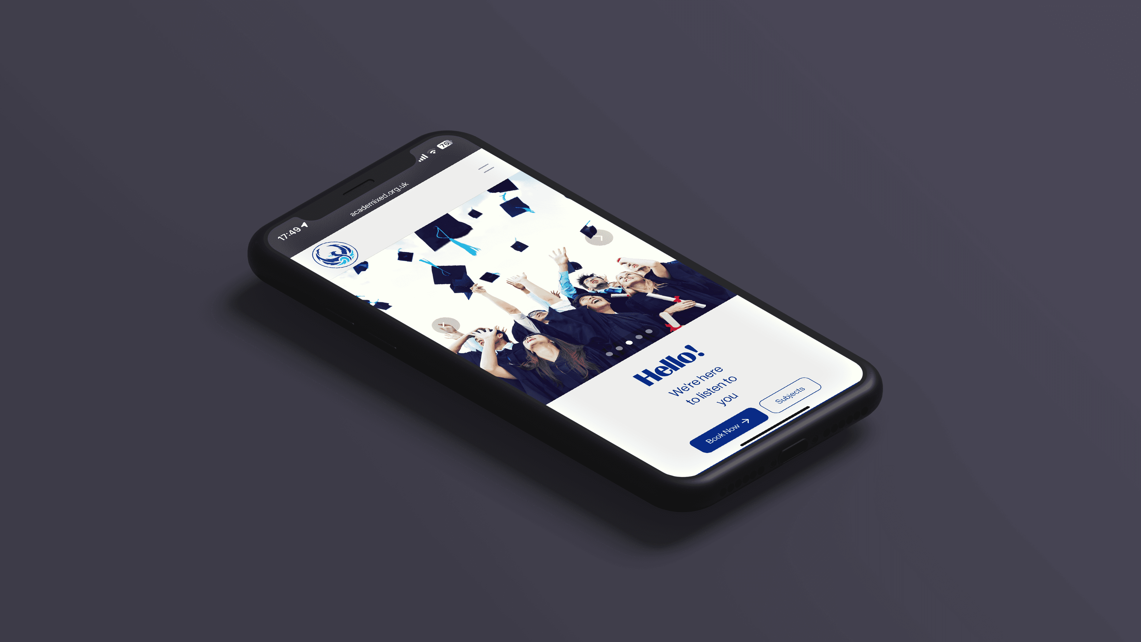
From the start, working alongside Susie, it became clear that the colour palette would be a significant design hurdle. Many people with Dyslexia and other neurodivergent conditions find black text on a white background difficult to read. To improve readability, we opted for a navy blue color palette, which offers a softer contrast and better accessibility.
Another challenge we faced was managing white space. We didn’t want to overwhelm visitors with too much text or clutter. Instead, we focused on creating a layout that was clean, spacious, and visually appealing. By emphasizing imagery and keeping the content concise, we aimed to show that learning can be engaging and enjoyable, rather than overwhelming.
Finally, the structure of each page required special attention. A one-size-fits-all approach wouldn't work here—each page needed to be designed individually to fit the specific topic it covered. This allowed us to tailor the user experience to ensure every section of the site communicated its message clearly and effectively.

Solution
To address the challenges, we took a user-centered approach to ensure the website would be both accessible and visually engaging.
For the color palette issue, we chose a navy blue background with softer text contrasts, enhancing readability for users with Dyslexia and other neurodivergent conditions. This simple change not only improved accessibility but also gave the site a professional and calming aesthetic.
In terms of managing white space, we struck a balance between text and visuals. By reducing unnecessary content and using larger, high-quality images, we conveyed key messages in a way that was clear and inviting. This approach helped make the site more engaging, highlighting that learning can be both fun and approachable.
Finally, each page was given individual attention to align with its specific content. Rather than using a standard template, we customized the layout for each section, ensuring it suited the topic and user needs. This flexibility allowed for a seamless user experience across the site, where each page felt purposeful and intuitive.
Together, these solutions resulted in a website that not only met the project goals but provided a more inclusive and enjoyable experience for a diverse audience.
Results
The outcome was a user-friendly interface that made it easy for users to find exactly what they needed, whether for themselves or their children. We implemented automated booking forms that significantly boosted conversion rates, along with streamlined contact forms and multiple conversion funnels. Throughout the design, I maintained a consistent theme of "fun" by using concise text and incorporating plenty of education-related images. Susie has expressed her satisfaction with the final result, and we’re both excited to see how this project evolves in the future.